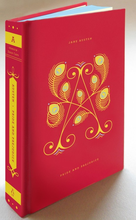
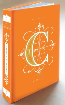
Well, they also did a "Drop Caps" series with covers and spines inspired by typography. And they are absolutely gorgeous.
Per the Penguin tumblr: "Penguin Drop Caps is a series inspired by typography—its beauty and its power of expression. A drop cap, or an initial cap, is the first letter of a word when designed and set larger than the surrounding text. It is used to introduce a new idea, paragraph, or chapter. We may recognize such elements from books of our childhood, from sacred and historic texts, and from beautiful early editions of classic literature. Whether they appear in illuminated fifteenth-century manuscripts set by scribes or digitally displayed on Jessica Hische’s own Daily Drop Cap blog, a drop cap letter impresses upon the reader the arrival of something of which to take note, something unique and special that deserves to be savored."
Check it out:
How perfect would these books be as a gift for either the book lover or design geek on your list? I want to stare at the covers for forever, but the spines would look amazing lined up on a bookshelf as well. And just think of the graphic impact of all those brightly colored spines in an all-white library! I. Die.
All information and pictures from the Penguin tumblr.


ooooh beautiful! I want!
ReplyDelete